Friday 15 February 2013


Friday 8 February 2013
Final Logo Design Change

I have reviewed my final logo design in light of my Digipak, Website and Music video. I decided to add a fire element to my logo in order for it to be synergistic. Fire is a key theme throughout my band, as its closely related to destruction and rebellion. Which is the message my artist is going for. The florescent colours are still visible so it still creates a club/party vibe and adds to the 'caution sign' triangle, connotating danger along with the fire. Overall, I still believe I have created a successful logo that is suitable for a Dubstep artist.
Wednesday 6 February 2013
Friday 1 February 2013
Digipak Finished
 |
| Today I finally finished my artists Digipak and I am very pleased with it. I originally planned to do a 4 panel Digipak but I chose instead to do a 6 panel Digipak. I initially created a 4 panel one but I felt this wasn't good enough, it didn't really look effective enough to me. I had also edited many pictures for my Digipak and so I would only have room for three more pictures, as I had already decided my logo would be on the CD tray. So a 6 panel Digipak will allow me to use more of my pictures. |
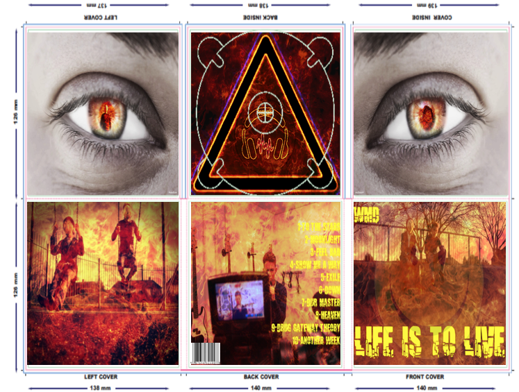  |
| This is my final Digipak design. It is synergistic as it keeps to the fire element that I have been incorporating in everything. It is very simplistic and eye catching, something that will appeal to our 'Struggler' target audience. They would not like to read lots so I had to keep as simplistic as possible, even using slang terms such as 'Famalam' to engage my audience and using as few words as possible. I have also incorporated as much as I have learned about dubstep digipaks into my digipak, for example I used very simplistic shots of the artist, this builds on the 'star persona' as a lot of emphasis is placed on him in the album. This is a common feature for a lot of dubstep digipaks. I have also used the same colour scheme on all the pictures in the digipak in order to make it look professional and eye catching. |
 |
| Front Cover I chose this picture for the front cover because I believe it was the most suitable out of all the photo's we took that day. My artist is posed on a skate park, which had 'Life is to Live' sprayed painted onto it which was the inspiration for our album title. Unfortunately, because of my choice of colour scheme and adding a fire element to it, this was covered up. So I instead used the 'Cracked' font to write it instead, which I think works just as well. I also incorporated the mask in order to place more emphasis onto it, especially when the fans get round to watching the music video. The smiley face, the font, and the fire background make the front cover look very eye catching which is my desired affect. |
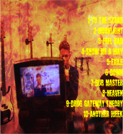 |
| Back Cover I added this photo as the back cover as I believed it was an interesting shot to use. I like the double view you get of Dean, through the camera and just in the background. I would have been happier if I could have the focus on the camera screen and have Dean in the background blurred as I think this will look better but I am happy with how it is. I then added the list of songs to the side as it would still allow fans to see the artist as he's performing in front of the camera as it doesn't obstruct the focus of the image. The yellow font is also clearly visible and easy to read there where as this was unsuccessful in other photo's I tried this on. |
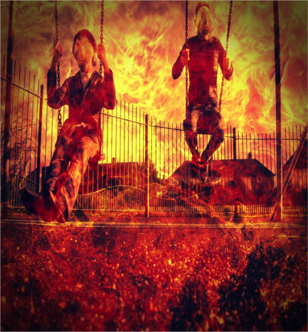 |
| Left Cover This was an interesting choice as dubstep usually has a playful aspect about it. As part of my research, I watched "Skrillex - Ruffneck" which had Santa doing drugs, but it still had a fun element to it despite the seriousness of the video by using drugs, i.e. the use of Santa and the slow motion run they do when the guys are chasing Santa. From that, and other research into dubstep, I realised dustep is very self aware, it doesn't try and take itself seriously, it like to be fun and random So I thought a shot of the artist and the figure who had chased my artist, playing like kids on the swings together would add a comical aspect to my digipak which the audience would appreciate. |
 |
| Cover Inside When I was experimenting with all the different affects on Phixr, I found the eye template and began playing around with various photo's. I wanted to have the eye template for both the 'Cover Inside' and 'Left Cover' so it would give the effect of the two eyes from the same person looking at you when you open the digipak. I added the fire effect to the eyes and added both a picture of the chaser and a picture of my artist in the mask. This again places emphasis on the mask and creates synergy through the use of the mask, the fire effect and images i.e. Artist and chaser. |
 |
| Left Cover When I was experimenting with all the different affects on Phixr, I found the eye template and began playing around with various photo's. I wanted to have the eye template for both the 'Cover Inside' and 'Left Cover' so it would give the effect of the two eyes from the same person looking at you when you open the digipak. I added the fire effect to the eyes and added both a picture of the chaser and a picture of my artist in the mask. This again places emphasis on the mask and creates synergy through the use of the mask, the fire effect and images i.e. Artist and chaser. |
 |
| Back Inside I used the logo as my back inside in order to create synergy so people will be able to associate the logo with my artist. I wanted to place my logo somewhere on my digipak, but I thought placing it as my back inside would be the most effective as they'll always see it every time they remove and put back the CD. I had originally planned to place it on the front cover of my album but when I tried it, I felt it didn't look right and the dark read fire of my logo clashed with the bright orange fire that was on the front cover. So I opted instead to put it as my back inside. |
Website complete
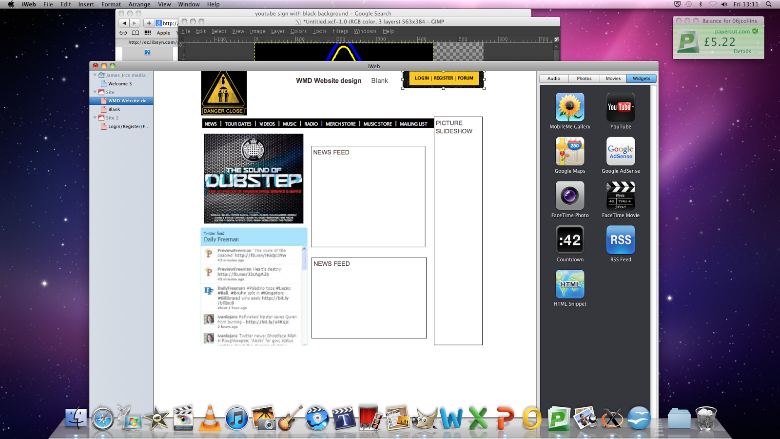


Today I manged to finish my website and I am very happy with it. I have kept largely with my original design, I have extended the website from what I originally planned in order to create more space to accommodate for my music video and more news links, otherwise everything would be cramped and look very amateurish and unprofessional.
I have gained some peer review on my website and they thought it looked very good and professional. They said I have spaced everything out very well which makes it looks more professional and the conent makes it seem like a dubstep website, such as the use of slang words like 'Famalams' and the font style also is very suitable. The news feed they thought was especially good as it looks like my artist is engaging the audience and talking directly to you. So overall I believe I have created a successful website that is suitable for my dubstep artist.
Subscribe to:
Posts (Atom)